Chapter 1 Introductory Statistics in R
We begin our dive into Statistical Modeling by first reviewing content from introductory statistics and introduce fundamental elements of the R programming language (R Core Team, 2019). The learning objective of this chapter include:
- Review of the fundamental concepts of populations, samples, parameters and statistics.
- Review of exploratory and descriptive statistics: numerical quantities and graphs.
- An introduction and overview of the R software for statistical computing.
- Basic statistical inference through a two-sample \(t\)-test and confidence intervals.
1.1 Goals of a statistical analysis
The field of Statistics can broadly be defined as the study of variation.
We collect sample data from a parent population of interest. Ultimately, we are interested in characteristics or parameters about the population. We use a sample because it is unfeasible or overly costly to collect data from every member of a population (that process is known as a census).
Good statistical practice demands that we collect the sample data from the population in such a manner so as to ensure that the sample is representative; i.e., it is not presenting a systematic bias in its representation. With a good sample, we can make decisions about the population using that sample.
There are two main sources of variation that arise in statistical analysis:
Measurements of the same attribute will vary from observation to observation. This is natural and is to be expected. Consider how your height may vary compared to your parents and siblings. This random (or stochastic) component is typically modeled through probabilistic assumptions (think the Normal distribution from your Intro Stat course). This component is often called noise or error, although the later is a misnomer.
We are interested in some parameter that helps describes characteristics of the population. Any characteristic computed from the sample is known as a sample statistic. Ideally, this statistic will reasonably approximate the parameter of interest. Since only a subset of the population is used in the calculation of a statistic, it will vary from their corresponding population parameter. In fact, different samples from the same population will produce different estimates of the same parameter, so sample statistics also vary from sample to sample.
This variation gives rise to the concept of uncertainty in any findings we make about a population based on sample data. A meaningful statistical analysis helps quantify this uncertainty.
The goals of a statistical analysis typically are
- to make sense of data in the face of uncertainty,
- to meaningfully describe the patterns of variation in collected sample data,
- and use this information to make reliable inferences/generalizations about the parent population.
1.1.1 Conducting a statistical analysis
The practice of statistics starts with an underlying problem or contextual question. Prior to performing an analysis, we must that original question. Some examples may include:
- Are fish sensitive to Ultraviolet light?
- What socio-economic variables and demographics predict college graduation rates?
- Can we determine if there truly is a home field advantage in sports?
- Does a new experimental drug improve over an existing drug?
From there, data is collected through an experiment, by observation or via a survey. You then proceed with a data analysis, and then finish with statistical and contextual conclusions.
Unfortunately, it is common for inexperienced statisticians to start with a complex analysis without ever considering the objectives of the study. It is also common for inexperienced statisticians to not consider whether the data are appropriate for the chosen analysis and whether the underlying question can be answered.
We recommend you follow the guidance (outlined below) provided in Chapter 1 of the text by Faraway (2004) – Look before you leap!
Problem formulation - To perform statistical analysis correctly, you should:
Understand the context. Statisticians often work in collaboration with researchers in other disciplines and need to understand something about the subject area. You should regard this as an opportunity to learn something new. In essence, a Statistician must be a renaissance person – some level of elementary expertise is needed in the subject area.
Understand the objectives. Again, often you will be working with a collaborator who may not be clear about their objectives. Ideally they approach a statistician before data collection. This helps alleviate several potential issues. The statistician can grain an understanding of the contextual problem, and assess the appropriateness of data collection procedure to answer the underlying contextual questions.
Beware of contextual problems that are “fishing expeditions”: if you look hard enough, you’ll almost always find something. But… that something may just be a coincidence of no meaningful consequence. Also, sometimes collaborators request a more complicated analysis is performed than is necessary. You may find that simple descriptive statistics are all that are really required. Even if a more complex analysis is necessary, simple descriptive statistics can provide a valuable supplement.
- Translate the problem into statistical terms. This can be a challenging step and oftentimes requires creativity on the part of the statistician (in other words, not every problem fits into a neat little box like in an intro stats course!). Care must be taken at this step.
Connected to the guidance is a good understanding of the Data Collection - It is vitally important to understand how the data was collected. Consider:
- Are the data observational or experimental? Are the data a “sample of convenience”, or were they obtained via random sampling? Did the experiment include randomization? How the data were collected has a crucial impact on what conclusions can be meaningfully made. We discuss this topic more in Section 2.1.
- Is there “non-response”? The data you don’t see may be just as important as the data you do see! This aligns with the concern of whether a sample is representative of the intended target population.
- Are there missing values? This is a common problem that can be troublesome in some applications but not a concern in others. Data that are “missing” according to some pattern or systematic procedure are particularly troublesome.
- How are the data coded? In particular, how are the qualitative or categorical variables represented? This is important on the implementation of statistical methods in R (and other languages).
- What are the units of measurement? Sometimes data are collected or represented using far more digits than are necessary. Consider rounding if this will help with the interpretation.
- Beware of data entry errors. This problem is all too common, and is almost a certainty in any real dataset of at least moderate size. Perform some data sanity checks.
1.2 Introduction to R
Much like a chemist using test tubes & beakers, or a microbiologist using a microscope, the laboratory instrument for modern statistics is the computer. Many software packages exist to aid a modern statistician in the conducting of an analysis. This text uses the R Language and Environment for Statistical Computing (R Core Team, 2019). Many other tools exist and they can generally be lumped into two categories: point and click interfaces, and coding languages. The point and click tools tend to be easier to use but may have limited features & methods available. The coding languages are substantially more versatile, powerful and provide solutions that are reproducible, but may have a steeper learning curve. We recap a few of the common tools below.
- Excel - Microsoft Excel is a common point and click spreadsheet tool that includes many statistical methods. In fact, it is possible you used Excel in your Introductory Statistics course.
- SPSS - Also known as the Statistical Package for the Social Sciences, SPSS looks similar to Excel but has many more statistical tools included. SPSS includes the ability to code in Python.
- Minitab - Another point and click statistical tool. It’s appearance is similar to Excel but, similar to SPSS, includes most common statistical methods.
- JMP - Pronounced as “jump”. This tool includes a graphical interface (much like Excel) but also provides the user the ability to code. It is commonly used in the design of experiments and some intro stat courses.
- SAS - arguable the first statistical software that was widely used. SAS is a coding language that has powerful data handling abilities and includes implementations for many statistical methods. There is a graphical version known as Enterprise Miner.
- Python - A high-level general-purpose programming language, Python has become very popular in the Data Science industry due to its ease of use, the large community of support and add-ons (called modules) that implement data analysis methods.
So why R?? - With so many tools available, you may ask, “why do we use R?” Simply put, R incorporates many of the features available in these other languages. Specifically,
- Similar to the other coding languages, R provides reproducible results!
- R is free!
- Installing a working version of R tends to be easier than Python.
- Similar to Python, R is fairly easy to learn.
- But unlike in Python, performing statistical analysis in R is a bit more straightforward.
- With Python, many Interactive Development Environments are popular, but RStudio is the standard for coding in R - this makes implementation in the classroom a bit easier since everyone uses the same tools.
- Similar to Python, R includes add-ons. In R we call them packages and we will make use of several.
- Users can create their own packages to share with others!
- Similar to SAS, R has powerful data handling features and implementations for many statistical methods.
1.3 Data frames
A statistical dataset in R is known as a data frame, or data.frame.
It is a rectangular array of information (essentially a table or matrix or or spreadsheet). Rows of a data frame constitute different observations and the columns constitute different variables measured.
For example, imagine we record the name, class standing, height and age of all the students in a class: the first column will record each students’ name, with the second column recording their standing (e.g., junior, senior, etc…), the third column records the students’ height and fourth column their age. Each row corresponds to a particular student (an observation) and each column a different property of that student (a variable).
1.3.1 Built-in data
R packages come bundled with many pre-entered datasets for exploration purposes. For example, here is the data frame stackloss from the datasets package (which loads automatically upon starting R):
##    Air.Flow Water.Temp Acid.Conc. stack.loss
## 1        80         27         89         42
## 2        80         27         88         37
## 3        75         25         90         37
## 4        62         24         87         28
## 5        62         22         87         18
## 6        62         23         87         18
## 7        62         24         93         19
## 8        62         24         93         20
## 9        58         23         87         15
## 10       58         18         80         14
## 11       58         18         89         14
## 12       58         17         88         13
## 13       58         18         82         11
## 14       58         19         93         12
## 15       50         18         89          8
## 16       50         18         86          7
## 17       50         19         72          8
## 18       50         19         79          8
## 19       50         20         80          9
## 20       56         20         82         15
## 21       70         20         91         15
This data frame contains 21 observations on 4 different variables. Note the listing of the variable names, this is known as the header.
Another famous dataset is the Edgar Anderson’s Iris data and is included in R:
##    Sepal.Length Sepal.Width Petal.Length Petal.Width Species
## 1           5.1         3.5          1.4         0.2  setosa
## 2           4.9         3.0          1.4         0.2  setosa
## 3           4.7         3.2          1.3         0.2  setosa
## 4           4.6         3.1          1.5         0.2  setosa
## 5           5.0         3.6          1.4         0.2  setosa
## 6           5.4         3.9          1.7         0.4  setosa
## 7           4.6         3.4          1.4         0.3  setosa
## 8           5.0         3.4          1.5         0.2  setosa
## 9           4.4         2.9          1.4         0.2  setosa
## 10 4.9 3.1 1.5 0.1 setosa## Sepal.Length Sepal.Width Petal.Length Petal.Width Species
## 144 6.8 3.2 5.9 2.3 virginica
## 145 6.7 3.3 5.7 2.5 virginica
## 146 6.7 3.0 5.2 2.3 virginica
## 147 6.3 2.5 5.0 1.9 virginica
## 148 6.5 3.0 5.2 2.0 virginica
## 149 6.2 3.4 5.4 2.3 virginica
## 150 5.9 3.0 5.1 1.8 virginicaHere the head() function prints the first few observations of the dataset, we specified the first 10 rows. The tail() functions prints out the last n rows (here specified to be 7). The size of the dataset is actually bigger and can be determined with the dim function,
## [1] 150 5There are 150 observations on 5 variables (Sepal.Length, Sepal.Width, Petal.Length, Petal.Width, and Species).
Another useful function to quickly look at data is the glimpse() function in the R package dplyr, part of the tidyverse collection of packages (Wickham, 2017). Here we apply the function to the built in dataset esoph, which is from a case-control study on esophageal cancer.
## Rows: 88
## Columns: 5
## $ agegp     <ord> 25-34, 25-34, 25-34, 25-34, 25-34, 25-34, 25-34, 25-34, 25-3…
## $ alcgp     <ord> 0-39g/day, 0-39g/day, 0-39g/day, 0-39g/day, 40-79, 40-79, 40…
## $ tobgp     <ord> 0-9g/day, 10-19, 20-29, 30+, 0-9g/day, 10-19, 20-29, 30+, 0-…
## $ ncases    <dbl> 0, 0, 0, 0, 0, 0, 0, 0, 0, 0, 0, 0, 1, 0, 0, 0, 1, 0, 0, 0, …
## $ ncontrols <dbl> 40, 10, 6, 5, 27, 7, 4, 7, 2, 1, 2, 1, 0, 1, 2, 60, 13, 7, 8…
There are 88 observations in this study with 5 recorded variables.
1.3.2 Types of Data
You should notice in the examples above we see a mix of numeric and character values in the data frames. In R, every object has a type or class. To discover the type for a specific variable use the class function,
## [1] "data.frame"We see that the class of the object iris is a data.frame consisting of 150 rows and 5 columns. You should also note that the first four columns are numeric while the last column appears to be characters. We can explore the class of each variable by specifying the name of the column of the dataset using the $ notation. First, let’s get the list of variables in the dataset using the names() function.
## [1] "Sepal.Length" "Sepal.Width" "Petal.Length" "Petal.Width" "Species"## [1] "numeric"## [1] "factor"The class of Sepal.Length is numeric, which should not be too surprising given the values are numbers. The class of Species on the other hand is a factor. In R, a factor is a categorical variable! Here it happens to be labeled with the scientific species name, but R treats it as a category.
Note: The factor class can be quite important when performing Statistics. Specifically, when categories are coded as numbers it can be problematic. Depending if a variable is a factor or numeric, it can cause statistical methods to perform differently.
1.3.3 Importing datasets into R
In practice you will often encounter datasets from other external sources. These are most commonly created or provided in formats that can be read in Excel. The best formats for importing dataset files into R is space-delimited (typically with the file extension .txt), tab-delimited text (either the file extension .txt or .tsv) or comma-separated values (file extension .csv). R can handle other formats, but these are the easiest with which to work.
There are multiple functions to import a data file in R. The tools we will outline here include many functions in the readr package (Wickham and Hester, 2021), part of the tidyverse. We recommend reading through the Vignette by running the command vignette("readr") in the console.
1.3.3.1 read_table() – for Space delimited files
One common tool is the read_table() command. Below are two examples:
- Read a file directly from the web. The code imports the file
univadmissions.txt(details about the data are below) from the textbook data repository into the current R session, and assigns the nameuadatato the data frame object:
## [1] "character"## # A tibble: 6 × 5
## id gpa.endyr1 hs.pct act year
## <dbl> <dbl> <dbl> <dbl> <dbl>
## 1 1 0.98 61 20 1996
## 2 2 1.13 84 20 1996
## 3 3 1.25 74 19 1996
## 4 4 1.32 95 23 1996
## 5 5 1.48 77 28 1996
## 6 6 1.57 47 23 1996A few notes on the code above. In the first line, we are creating a string of characters (that happens to be a web address) and assigning it to the R object site using the <- notation. You should note the class of the object site is character. The third line, options(readr.show_col_types = FALSE), is entirely optional and tells the readr package to suppress some extra output from display. The key is we are applying the function read_table() with the file specified in the site variable. Lastly, the output of the function is being assigned to uadata, again using the <- notation. We will be using this same data again below.
- Another option is to download the file to your computer, then read it. You could go to the provided URL and save the data file to your default working directory on your computer. After saving it into a folder (or directory), you can read the file with code similar to:
If you save the file to a directory on your computer other than the local directory (where your R code is stored), you must provide the path in the read_table() command:
The function read_table() automatically converts a space delimited text file to a data frame in R.
1.3.3.2 read_csv() – for Comma Separated Value files
Similar to the examples above, reading in a Comma Separated Value (CSV) file is very similar. This is becoming the standard format for transferring files. An example of some non-executed code is provided below:
Note: the file univadmissions.csv does not exist but this code has been included for example purposes.
1.3.3.3 load() – Loading an existing R data.frame
If data has already been input and processed into R as a data.frame, it can be saved in a format designed for R using the save() function and then can be reloaded using load(). For example, first we may save the University Admidssion data
Then, sometime later, we may “load” that data into R
1.4 Referencing data from inside a data frame
We saw in the example above that we can access a specific variable within a dataset using the $ notation. We can also access specific observations in the dataset based on rules we may wish to implement. As a working example we will consider the university admissions data we read in above.
Example: University admissions (originally in Kutner et al. (2004)).
The director of admissions at a state university wanted to determine how accurately students’ grade point averages at the end of their freshman year could be predicted by entrance test scores and high school class rank. The academic years covered 1996 through 2000. This example uses the univadmissions.txt dataset in the repository. The variables are as follows:
id– Identification numbergpa.endyr1– Grade point average following freshman yearhs.pct– High school class rank (as a percentile)act– ACT entrance exam scoreyear– Calendar year the freshman entered university
This is the first dataset we input in the code above, creating the uadata data frame.
The tidyverse package (Wickham, 2017) is actually a wrapper for many R packages. One of the key packages we use for data processing is the dplyr package (Wickham, François, et al., 2021). It includes many functions that are similar to SQL (for those who know it). These tools tend to be very readable and easy to understand. First we will load the package tidyverse and then take a glimpse of the dataset:
## Rows: 705
## Columns: 5
## $ id         <dbl> 1, 2, 3, 4, 5, 6, 7, 8, 9, 10, 11, 12, 13, 14, 15, 16, 17, …
## $ gpa.endyr1 <dbl> 0.98, 1.13, 1.25, 1.32, 1.48, 1.57, 1.67, 1.73, 1.75, 1.76,…
## $ hs.pct     <dbl> 61, 84, 74, 95, 77, 47, 67, 69, 83, 72, 83, 66, 76, 88, 46,…
## $ act        <dbl> 20, 20, 19, 23, 28, 23, 28, 20, 22, 24, 27, 21, 23, 27, 21,…
## $ year       <dbl> 1996, 1996, 1996, 1996, 1996, 1996, 1996, 1996, 1996, 1996,…
In the code above, you may note that everything to the right of a # is a comment – this is, text included in code that does function or execute as code. Comments are a useful tool to provide notes to use yourself about the code.
Key features when using the tidyverse is the pipe command, |> and actions on a data.frame. These actions are function calls and other sources may call them verbs, as you are performing some action on he data. We will introduce the function calls as needed.
Note: there are actually two different syntax for using the pipe in R, |> and %>%. In the original version of this text, we used the latter %>% as the newer |> was not included in previous versions of R. At this point, |> is preferred but some examples may still use the older %>% notation.
As an example of some basic data processing, consider the case of extracting students with a GPA greater than 3.9:
- Take the
data.frameuadata(from above) and pipe it (send it) to a function (or action), in this case the filter function. - Then
filterit based on some criteria, saygpa.endyr1 > 3.9.
## # A tibble: 29 × 5
##       id gpa.endyr1 hs.pct   act  year
##    <dbl>      <dbl>  <dbl> <dbl> <dbl>
##  1   138       3.91     99    28  1996
##  2   139       3.92     93    28  1996
##  3   140       4        99    25  1996
##  4   141       4        92    28  1996
##  5   142       4        99    33  1996
##  6   266       3.92     85    15  1997
##  7   267       3.92     63    23  1997
##  8   268       3.92     98    23  1997
##  9   269       3.93     99    29  1997
## 10   270       3.96     99    29  1997
## # ℹ 19 more rows
Another useful dplyr command for choosing specific variables is the select function. Here, we select the ACT scores for students who have a first year GPA greater than 3.9 and with a graduating year of 1998.
## # A tibble: 6 × 1
##     act
##   <dbl>
## 1    28
## 2    31
## 3    31
## 4    21
## 5    27
## 6    32
Note in the example above, we take the uadata and pipe it to a filter, which selects only those observations with gpa.endyr1 greater than 3.9 and year equal (==) to 1998, then we pipe that subset of the data to the select function that returns the variable act.
IMPORTANT NOTE - R is an evolving language and as such occasionally has some wonky behavior. In fact, there are multiple versions of both the filter and select functions in R. If you ever use one and receive a strange error (comparison is possible only for atomic and list types or an unused argument error), first check for a typo. If the error still occurs it is likely the case that R is trying to use a different version of the filter or select. You can always force R to use the dplyr version by specifying the package as in the example below:
1.5 Missing values and computer arithmetic in R
Sometimes data from an individual is lost or not available, these are known as missing values. R indicates such occurrences using the value NA. Missing values often need to be addressed because simply ignoring them when performing certain functions will result in no useful output.
As an example, we cannot find the mean of the elements of a data vector when some are set to NA. Consider the simple case of a vector of 6 values with one NA.
## [1] "numeric"## [1] NAHere, the object x is a vector of class numeric. We will not be working with vectors much in this class (although a column in a data frame can be considered a vector) but we do so here to demonstrate functionality.
Since one of the observations is missing, NA, the mean of the vector is also “not available” or NA.
This is not incorrect: logically speaking there is no way to know the mean of these observations when one of them is missing. However, in many cases we may still wish to calculate the mean of the non-missing observations.
Many R functions have a na.rm= logical argument, which is set to FALSE by default. It basically asks if you want to skip, or remove, the missing values before applying the function. It can be set to TRUE in order to remove the NA terms. For example,
## [1] 16.4The number system used by R has the following ways of accommodating results of calculations on missing values or extreme values:
NA: Not Available. Any data value, numeric or not, can beNA. This is what you use for missing data. Always useNAfor this purpose.NaN: Not a Number. This is a special value that only numeric variables can take. It is the result of an undefined operation such as 0/0.Inf: Infinity. Numeric variables can also take the values-InfandInf. These are produced by the low level arithmetic of all modern computers by operations such as 1/0. (You should not think of these as values as real infinities, but rather the result of the correct calculation if the computer could handle extremely large (or extremely small, near 0) numbers; that is, results that are larger than the largest numbers the computer can hold (about \(10^{300}\))).
Scientific notation. This is a shorthand way of displaying very small or very large numbers. For example, if R displays 3e-8 as a value, it means \(3\times 10^{-8} = 0.00000003\). Similarly, 1.2e4 is \(1.2\times 10^4 = 12000\).
1.6 Exploratory Data Analysis (EDA)
The material presented in this section is typically called descriptive statistics in Intro Statistics books. This is an important step that should always be performed prior to a formal analysis. It looks simple but it is vital to conducting a meaningful analysis. EDA is comprised of:
- Numerical summaries
- Means & medians (measures of centrality)
- Standard deviations, range, Interquartile Range (IQR) (measures of spread)
- Percentiles/quantiles & Five-number summaries (assessment of distributions)
- Correlations (measures of association)
- Graphical summaries
- One variable: boxplots, histograms, density plots, etc.
- Two variables: scatterplots, side-by-side boxplots, overlaid density plots
- Many variables: scatterplot matrices, interactive graphics
We look for outliers, data-entry errors, skewness or unusual distributions using EDA. We may ask ourselves: “are the data distributed as you expect?” Getting data into a form suitable for analysis by cleaning out mistakes and aberrations is often time consuming. It often takes more time than the data analysis itself! In this course, data will usually be ready to analyze but we will occasionally intermix messy data. You should realize that in practice it is rare to receive clean data.
1.6.1 Numeric Summaries
1.6.1.1 Measures of centrality and quantiles
Common descriptive measures of centrality and quantiles from a sample include
- Sample mean – typically denoted by \(\bar{x}\), this is implemented in the function
mean() - Sample median – this is implemented in the function
median() - Quantiles – Quantiles, or sample percentiles, can be found using the
quantile()function.- Three common quantiles are \(Q_1\) (the sample \(25^\mathrm{th}\) percentile, or first quartile), \(Q_2\) (the \(50^\mathrm{th}\) percentile, second quartile or median) and \(Q_3\) (the sample \(75^\mathrm{th}\) percentile or third quartile).
- Min and Max – the Minimum and Maximum values of a sample can be found using the
min()ormax()functions.
Each of these measures are covered in a typical introductory statistics course. We refer you to that material for more details.
1.6.1.2 Measuring variability
Earlier we defined statistics as the ‘study of variation’. The truth is that everything naturally varies:
- If you measure the same characteristic on two different individuals, you would likely get two different values (subject variability).
- e.g., the pulse rate of two individuals is likely to be different.
- If you measure the same characteristic twice on the same individual, you may get two different values (measurement error).
- e.g., if two different people manually measured someone’s pulse rate, you may get different results.
- If you measure the same characteristic on the same individual but at different times, you would potentially get two different values (temporal variability).
- e.g., measuring someone’s pulse rate while resting compared to while performing exercise sometime later.
Because almost everything varies, simply determining that a variable varies is not very interesting. The goal is to find a way to discriminate between variation that is scientifically interesting and variation that reflects background fluctuations that occur naturally. This is what the science of statistics does!
Having some intuition about the amount of variation that we would expect to occur just by chance alone when nothing scientifically interesting is key. If we observe bigger differences than we would expect by chance alone, we may say the result is statistically significant. If instead we observe differences no larger than we would expect by chance alone, we say the result is not statistically significant.
Although often covered in introductory statistics courses, due to importance we review measuring the variance of a sample.
Variance
A variance is a numeric descriptor of the variation of a quantity. Variances will serve as the foundation for much of what we use in making statistical inferences in this course. In fact, a standard method of data analysis for many of the problems we will encounter is known as analysis of variance (shorthanded ANOVA).
You were exposed to variance in your introductory statistics course. What is crucial now is that you understand what you are finding the variance of; i.e., what is the “quantity” we referred to in the preceding paragraph? Consider the following example:
Example. Suppose you collect a simple random sample of fasting blood glucose measurements from a population of \(n\) diabetic patients, where \(n\) is the standard notation for the size of a sample. The measurements, or observations, are denoted \(x_1\), \(x_2\), \(\ldots\), \(x_n\). What are some of the different “variances” that one might encounter in this scenario?
- The \(n\) sampled measurements vary around their sample mean \(\bar{x}\). This is called the sample variance (traditionally denoted \(s^2\)). The formula for \(s^2\) is provided below. In R, we compute this with the function
var(). - All fasting blood glucose values in the population vary around the true mean of the population (typically denoted with \(\mu\), the lowercase Greek ‘mu’). This is called the population variance (usually denoted \(\sigma^2\) where \(\sigma\) is the lowercase Greek ‘sigma’). Note that \(\sigma^2\) cannot be calculated without a census of the entire population, so \(s^2\) serves as an estimate of \(\sigma^2\).
- \(\bar{x}\) is only a sample estimate of \(\mu\), so we should expect that it will vary depending on which \(n\) individual diabetic patients are sampled (i.e., with a different sample we will calculate a different sample mean). This is called the variance of \(\bar{x}\), and is denoted \(\sigma_{\bar{x}}^2\). This variance, unlike the sample or population variance, describes how sample estimates of \(\mu\) vary around \(\mu\) itself. We will need to estimate \(\sigma_{\bar{x}}^2\), since it cannot be determined without a full survey of the population. The estimate of \(\sigma_{\bar{x}}^2\) is denoted \(s_{\bar{x}}^2\).
- The \(n\) sampled measurements vary around their sample mean \(\bar{x}\). This is called the sample variance (traditionally denoted \(s^2\)). The formula for \(s^2\) is provided below. In R, we compute this with the function
The variances cited above are each different measures. Even more measures of variability exist; for example, each different possible random sample of \(n\) patients will produce a different sample variance \(s^2\). Since these would all be estimates of the population variance \(\sigma^2\), we could even find the variance of the sample variances!
Some formulas:
\[\textbf{Sample Variance:}~~~ s^2 = \frac{1}{n-1}\sum_{i=1}^n (x_i - \bar{x})^2, \textrm{ for sample size } n\]
\[\textbf{Estimated Variance of}~ \bar{x}:~~~ s^2_{\bar{x}} = \frac{s^2}{n}\]
Three important notes:
- The general form of any variance is a sum of squared deviations, divided by a quantity related to the number of independent elements in the sum known as the degrees of freedom. So in general,
\[\textrm{Variance} = \frac{\textrm{sum of square deviations}}{\textrm{degrees of freedom}} = \frac{SS}{\textrm{df}}\]
The formula for the population variance \(\sigma^2\) is omitted since it is rarely used and requires the \(\mu\) to be a known value. In practice, this can only be calculated with a population census.
When considering how a statistic (like \(\bar{x}\)) varies around the parameter it is estimating (\(\mu\)), it makes sense that the more data you have, the better it should perform as an estimator. This is precisely why the variance of \(\bar{x}\) is inversely related to the sample size \(n\). As \(n\) increases, the variance of the estimate decreases; i.e., the estimate will be closer to the thing it is estimating. This phenomenon is known as the law of large numbers and is typically discussed in Introductory Statistics courses.
Standard deviations and standard errors
While variances are the usual items of interest for statistical testing, variances are always in units squared (look at the equation for \(s^2\) above). Often we will find that a description of variation in the original units of the quantity being studied is preferred, so we take their square roots and are back to the original units. The square root of a variance is called a standard deviation (SD). The square root of the variance of an estimate is called the standard error (SE) of the estimate:
\[\textbf{Sample Standard Deviation:}~~~ s = \sqrt{s^2} = \sqrt{\frac{1}{n-1}\sum_{i=1}^n (x_i - \bar{x})^2}, ~~~\textrm{ for sample size } n\]
\[\textbf{Standard error of}~ \bar{x}:~~~ s_{\bar{x}} = \sqrt{s^2_{\bar{x}}} = \sqrt{\frac{s^2}{n}} = \frac{s}{\sqrt{n}}\]
1.6.2 Numeric Summaries in R
We recommend using dplyr for data handling and summary statistics. We can pipe (|>) our data frame into a function to calculate numeric summaries, this function is summarize().
uadata |>
  pivot_longer(everything(), names_to="Variable", values_to="value") |>
  group_by(Variable) |>
  summarize(across(everything(),
                   list(Mean=mean, SD=sd, Min=min, Median=median, Max=max) ) )
## # A tibble: 5 × 6
## Variable value_Mean value_SD value_Min value_Median value_Max
## <chr> <dbl> <dbl> <dbl> <dbl> <dbl>
## 1 act 24.5 4.01 13 25 35
## 2 gpa.endyr1 2.98 0.635 0.51 3.05 4
## 3 hs.pct 77.0 18.6 4 81 99
## 4 id 353 204. 1 353 705
## 5 year 1998 1.40 1996 1998 2000For a brief moment ignore the code (we described below). Presented here are the mean, standard deviation, the minimum, median and maximum of each numeric variable in the University Admissions data frame. For example, the mean freshman year-end GPA over the period 1996-2000 was 2.98; the median over the same period was 3.05, suggesting the GPA distribution is slightly skewed left (not surprising). The range of the GPA distribution is from 0.51 to 4. The median ACT score for entering freshman was 25, and and the range of ACT scores was from 13 to 35.
1.6.2.1 Coding Notes
In tidyverse there is package called tidyr (Wickham, 2021) which is mainly comprised of two main functions: pivot_longer() and pivot_wider().
The purpose of the pivot_longer() function is to collect variables in a dataset and create a tall (or longer) dataset (this is typically known as going from wide-to-tall or wide-to-long format).
We specify the variables (or columns) we want to pivot (here we pivot on everything, thus everything() in the code), the name of the new variable (here called Variable) storing the column names, and the variable name that will store the values (here called value).
The pivot_wider() function essentially does the opposite, turning a tall data frame into a wide format.
In dplyr resides the function group_by().
This function essentially does some internal organization of our data.
Specifically, for each unique Variable name, it would group the data together.
So, all the gpa.endyr1 values will be considered a group, and separate from all the hs.pct and act groups.
This function is particularly useful when coupled with summarize() (such as in the example above) because summary statistics will be calculated for each group.
The function summarize() tells R to calculate summary statistics across rows (or grouped rows) within a data.frame. In the working example, we compute a list of summary statistics (hence, list(Mean=mean, SD=sd, Min=min, Median=median, Max=max)) on all the non-grouped variables (everything()). We will see more examples below.
The code above introduces a few keys points to know:
- The code is spread across multiple lines with most lines ending with the piping operator
|>. This is done for readability (and recommended by all users of R). When performing an analysis, you often will revisit the code at a later time. Readable code is paramount to reproducibility. - The
tidyversestructure of data processing is meant to be highly readable. Look back at the code and consider the following:- We get the university admissions data, and then send it to (
uadata |>) - the function
pivot_longer()that takes all columns, or variables (everything()) in the data set and stacks them on top of one another where a new variable calledVariabledesignates the variable from the wide version of the data, and the new variableValuesprovides the corresponding value, and then send it to (|>) - a function that internally organizes the dataset, treating all
Valueswith the sameVariablevalue as a group (group_by(Variable)), and then send it to (|>) - a function that will calculate summary statistics (
summarize()). This includes the mean, standard deviation, minimum, median and maximum of theValuesfor eachVariablevalue since the data had been grouped.
- We get the university admissions data, and then send it to (
Also note:
- Since we applied the command to the entire data frame (
everything()), we also see numeric summaries of the variableid, even though it is meaningless to do. (note: just because a computer outputs it, that doesn’t mean it’s useful) - If you look carefully, you’ll note that
yearis treated as a number as well (e.g., 1996, 1997, etc.). However, that doesn’t necessarily mean it should be treated as a numeric variable! It is meaningless to find numeric summaries, such as means or medians, for theyearvariable because it is qualitative (categorical) variable in the context of these data (again, just because a computer outputs it, that does not mean it is contextually correct).
These are common mistake to make. When R encounters a variable whose values are entered as numbers in a data frame, R will treat the variable as if it were a numeric variable (whether it is contextually or not).
If R encounters a variable whose values are character strings, R will treat the variable as a categorical factor.
But, in a case like year or id above, you have to explicitly tell R that the variable is really a factor since it was coded with numbers.
To do this, we will mutate the variables id and year and turn them into factors.
Here we tell R to take the uadata data, pipe it to the mutate function (which allows us to create and/or replace variables by changing/mutating them). We then assign the variables id and year as versions of themselves that are being treated as factors (or categories).
We can then check the type of each variable by summarizing over all the variables using the class function.
## # A tibble: 1 × 5
##   id     gpa.endyr1 hs.pct  act     year
##   <chr>  <chr>      <chr>   <chr>   <chr>
## 1 factor numeric    numeric numeric factor
Now calculate the summary statistics for only numeric variables (i.e., the use of the select(where(is.numeric)) function).
uadata |>
  select(where(is.numeric)) |>
  pivot_longer(everything(), names_to="Variable", values_to="value") |>
  group_by(Variable) |>
  summarize(across(everything(),
                   list(Mean=mean, SD=sd, Min=min, Median=median, Max=max) ) )
## # A tibble: 3 × 6
## Variable value_Mean value_SD value_Min value_Median value_Max
## <chr> <dbl> <dbl> <dbl> <dbl> <dbl>
## 1 act 24.5 4.01 13 25 35
## 2 gpa.endyr1 2.98 0.635 0.51 3.05 4
## 3 hs.pct 77.0 18.6 4 81 99When a dataset includes categorical variables, the main numeric measure to consider is the count (or proportions) of each category. To do this in R, we tell it to treat each category as a group and then count within the group. We will group_by the year and then within that year, count the number of observations (summarize(Count=n() ). We also add a new variable (using mutate) that is the proportion.
## # A tibble: 5 × 3
##   year  Count  Prop
##   <fct> <int> <dbl>
## 1 1996    142 0.201
## 2 1997    131 0.186
## 3 1998    154 0.218
## 4 1999    141 0.2
## 5 2000    137 0.194
Note the power of using the tidyverse tools (Wickham, 2017).
We are only scratching the surface of what can be done here.
For more information, we recommend looking into the Wrangling chapters in the book R for Data Science (Wickham et al., 2017).
1.6.3 Graphical Summaries
We begin a graphical summary with a matrix (or table) of univariate and bivariate plots using the ggpairs() function in the GGally package (Schloerke et al., 2018). The results can be seen in Figure 1.1.
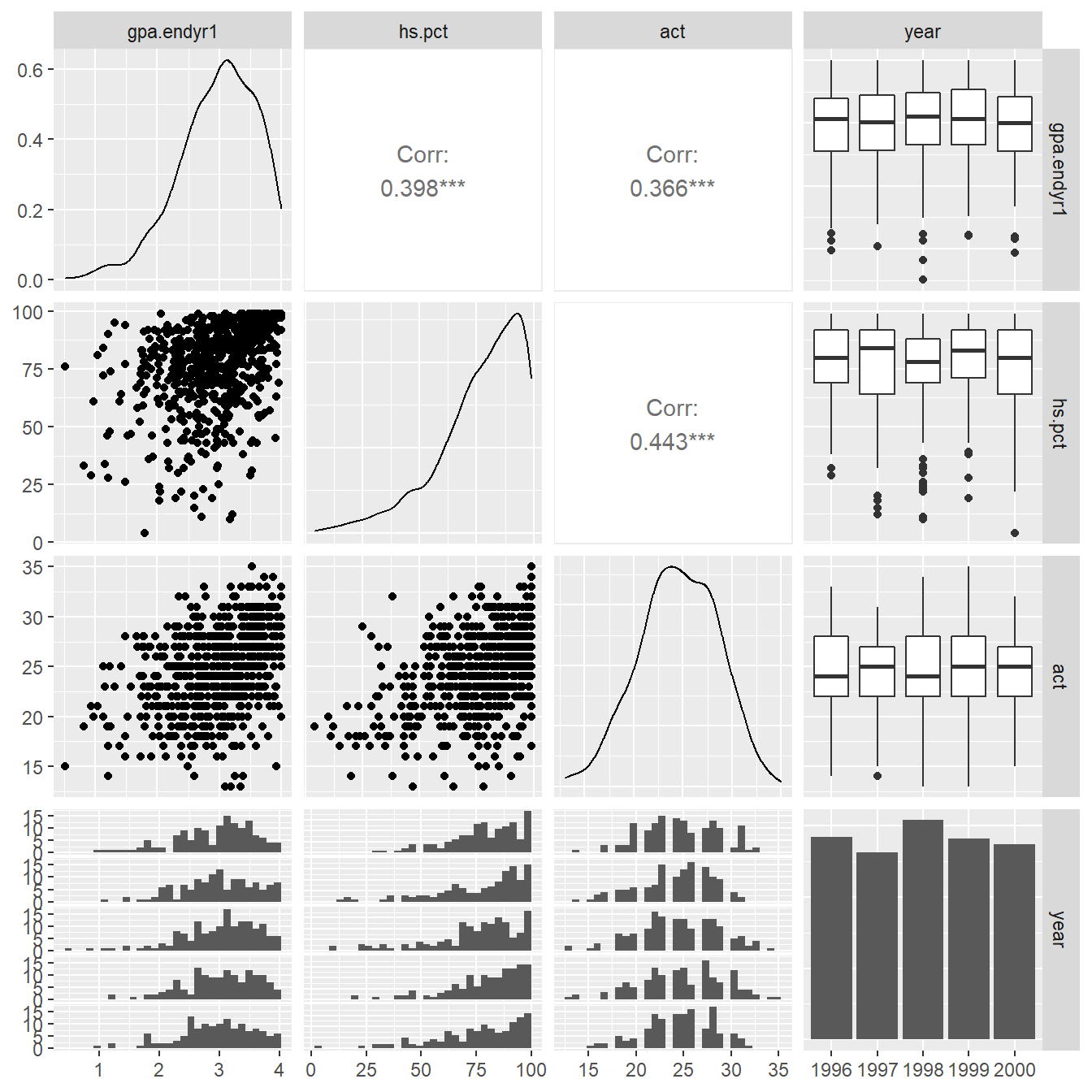
Figure 1.1: Pairs plot showing the relationship between the variables gpa.endy1, hs.pct, act and year.
1.6.3.1 Coding note
Here we specify to only plot using the variables in columns 2, 3, 4 and 5 (the 2:5). We do this because the id variable in uadata is an identifier (column 1) and unique identifies each observations – it is not a variable of statistical interest – we do not want to try and plot it.
Note that by default the function provides a collection of univariate and bivariate plots (Figure 1.1). We recap each of the plots provided (further details on each plot type is provided below).
- On the diagonal of the matrix we see univariate plots – density plots for the numeric variables and a bargraph of frequencies for categorical variable `year.
- In the upper right triangle of the matrix we see numeric measures for the amount of correlation between each of the numeric variables (Pearson Correlation coefficients, typically denoted with \(r\)). In the case of a numeric variable matched with a categorical variable, side-by-side boxplots are provided.
- In the bottom left triangle of the matrix scatterplots are provided to show the relationship between numeric variables. We also see histograms for each of the numerical variable stratified by the categorical variable
year. Now we will discuss each of the elements in more detail.
1.6.4 Distribution of Univariate Variables
The ggpairs function provides a look at the distributional shape of each variable using what is known as a density plot (this can be consider a more-modern, and arguably less subjective, histogram). The ggpairs function builds off a function known as ggplot() from the ggplot2 package (Wickham, 2016) which is included in tidyverse (Wickham, 2017).
We can build density plots directly using the geom_density() function as seen in the code below. The resulting density plot is in Figure 1.2.
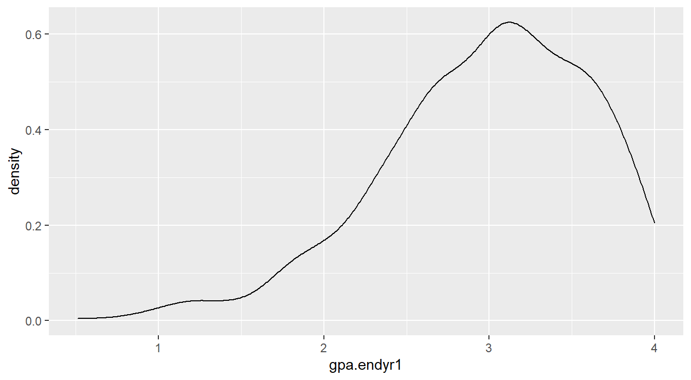
Figure 1.2: Density plot showing left-skewed distribution for the gpa.endyr1 variable
1.6.4.1 Coding Notes
Note the code is similar to the |> operator but with a +.
The trick to working with plotting on the computer is to think in terms of layers.
The first line ggplot(uadata) sets up a plot object based on the dataset uadata.
The + says to add a layer, this layer is a density plot (geom_density) where the aesthetic values include an \(x\)-axis variable matching that of gpa.endyr.
To generate even more complex distributional plots, first we need to perform some data processing using pivot_longer().
The purpose of the pivot_longer() function is to collect variables in a dataset and create a tall (or longer, wide-to-long) dataset (we saw an example earlier in Section 1.6.2).
We specify the variables (or columns) we want to pivot (the c(gpa.endyr1, hs.pct, act) part in the code below), the name of the new variable (here called var_names) storing the column names, and the variable name that will store the values (here called values).
uadata.tall <- uadata |>
  pivot_longer(c(gpa.endyr1, hs.pct, act),
               names_to="var_names", values_to="values" )
head(uadata)
## # A tibble: 6 × 5
## id gpa.endyr1 hs.pct act year
## <fct> <dbl> <dbl> <dbl> <fct>
## 1 1 0.98 61 20 1996
## 2 2 1.13 84 20 1996
## 3 3 1.25 74 19 1996
## 4 4 1.32 95 23 1996
## 5 5 1.48 77 28 1996
## 6 6 1.57 47 23 1996## # A tibble: 6 × 4
## id year var_names values
## <fct> <fct> <chr> <dbl>
## 1 1 1996 gpa.endyr1 0.98
## 2 1 1996 hs.pct 61
## 3 1 1996 act 20
## 4 2 1996 gpa.endyr1 1.13
## 5 2 1996 hs.pct 84
## 6 2 1996 act 20## [1] 705 5## [1] 2115 4Take a minute and step through the code to understand it.
The data is now in a tall, or long, format.
We can now utilize the ggplot2 package for more advanced plotting.
Here we want to draw a density plot for the values in the tall, or long, version of the dataset, called uadata.tall.
But we want a different plot for each var_names variable (that is, act, gpa.endyr1, and hs.pct) so we add a facet_grid() layer.
Figure 1.3 provides the result for the code below.
ggplot(uadata.tall) +
  geom_density(aes(x=values)) +
  facet_grid(.~var_names, scales="free_x") +
  theme_bw()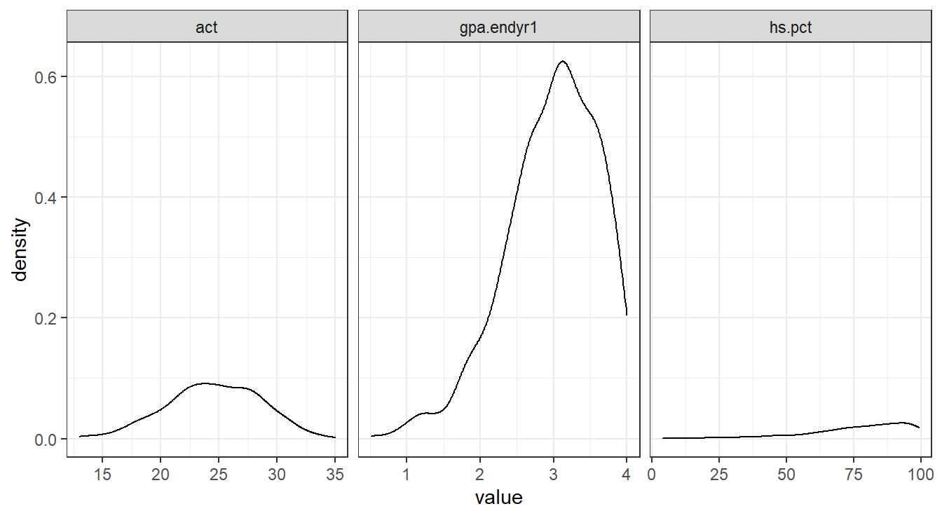
Figure 1.3: Side-by-side density plots showing the relative distributions of act, gpa.endyr1 and hs.pct.
1.6.4.2 Coding Notes
The facet_grid option tells the plot to draw each density plot for each observed value in var_names.
The facet feature is similar to the group_by statement when calculating summary statistics.
The theme_bw() specifies the plotting style (there are many others but we will typically use theme_bw(), theme_minimal() or the default behavior which corresponds to theme_grey()).
The free_x option tells the plot that each \(x\)-axis is on a different scale.
Feel free to modify the code to see how the plot changes!
We can see that GPA and high school percentile rankings are skewed left, and that ACT scores are reasonably symmetrically distributed.
Alternatively, we could build histograms to make the comparison.
ggplot(uadata.tall) +
  geom_histogram(aes(x=values), binwidth = 2.5) +
  facet_grid(var_names~., scales="free_y") +
  theme_bw()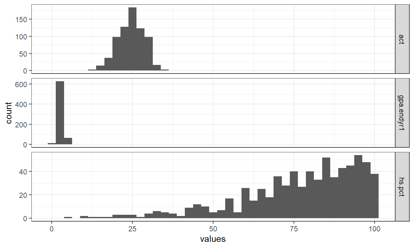
Figure 1.4: Stacked histogram showing the relative distributions of act, gpa.endyr1 and hs.pct.
Note the similarities and difference in Figures 1.3 and 1.4.
Depending on whether we facet on the \(y\)-axis or \(x\)-axis we can get different appearances.
Also note that the code for plotting a histogram is similar to that of a density plot (geom_histogram vs geom_density).
Bar Graphs
The best visual tool for simple counts is the Bar Graph (note: you should never use a pie chart, see here for an explanation ).
The code below generates a simple (and fairly boring) bar graph (Figure 1.5) displaying the number of observations for each year in the uadata.
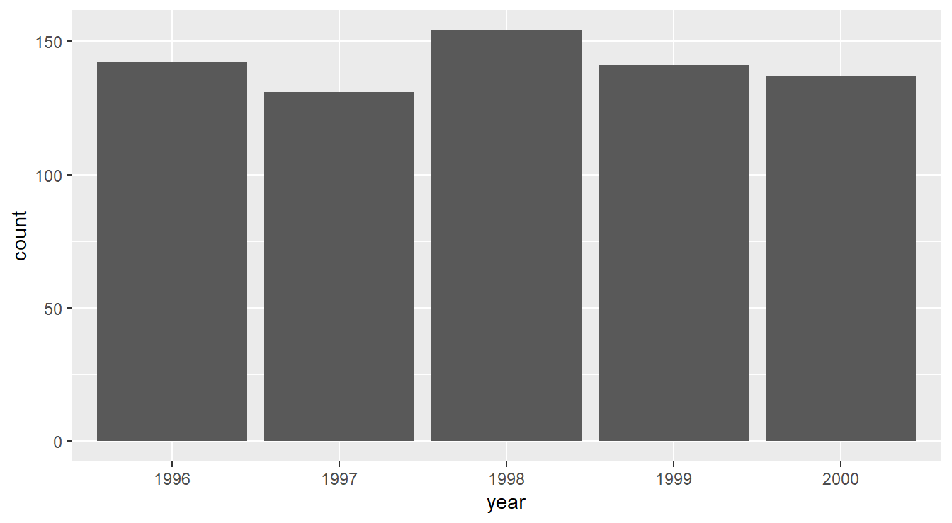
Figure 1.5: Bar graph displaying the number of observations in the uadata per year.
We see here that nothing too interesting is happening. A fairly uniform distribution of counts is seen across years.
1.6.5 Descriptive statistics and visualizations by levels of a factor variable
While the summaries above are informative, they overlook the fact that we have several years of data and that it may be more interesting to see how things might be changing year-to-year. This is why treating year as a factor is important, because it enables us to split out descriptions of the numeric variables by levels of the factor.
One of the simplest and best visualization tool for comparing distributions is the side-by-side boxplot, which displays information about quartiles (\(Q_1\), \(Q_2\) and \(Q_3\)) and potential outliers. The code below generates Figure 1.6.
ggplot(uadata) +
  geom_boxplot(aes(x=act, y=year) ) +
  labs(title="ACT scores of Incoming Freshmen",
       x="Composite ACT Score",
       y="Year") +
  theme_classic()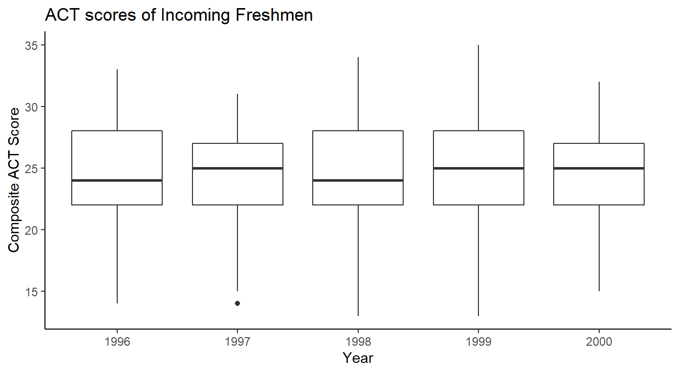
Figure 1.6: Side-by-side Box-whiskers plots showing the distribution of ACT scores in the uadata per year.
The code is similar to the examples above except now we call the geom_boxplot function.
Also note we are using theme_classic() which has some subtle differences compared to theme_bw() used above.
Lastly, we include proper labels and titles on our plot here for a more professional appearance.
Next we construct side-by-side boxplots by year for each of the three numeric variables in the data frame.
We utilize the taller or longer format of the admissions data in uadata.tall.
Two versions of this plot are provided in Figure 1.7 and Figure 1.8.
# Code for Figure 1.6
ggplot(uadata.tall) +
  geom_boxplot(aes(x=values, y=year) ) +
  facet_grid(.~var_names, scales="free_x") +
  theme_dark()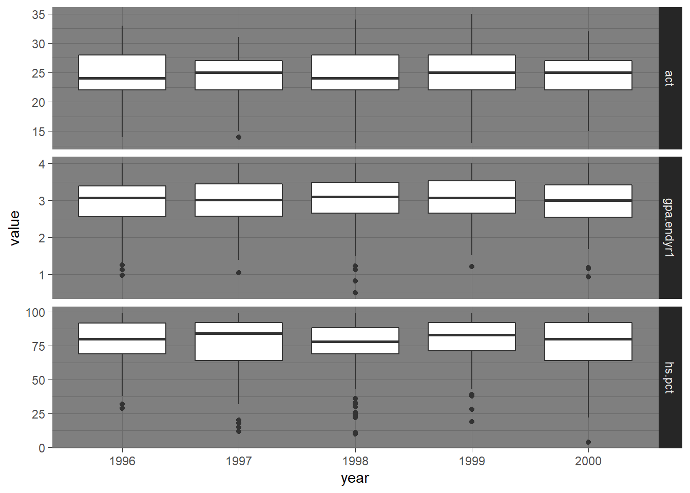
Figure 1.7: Side-by-side Box-whiskers plots showing the distributions of the variables act, gpa.endyr1 and hs.pct for each year in the uadata dataset.
Note another theme option, theme_dark() (obviously you will NOT want to use this theme if planning to print the document).
A more aesthetically pleasing version of the plot (with proper labeling) is generated with the code below and can be seen in Figure 1.8.
# Code for Figure 1.7
ggplot(uadata.tall) +
  geom_boxplot(aes(x=values, y=year) ) +
  facet_grid(.~var_names, scales="free_x") +
  labs(y="Year", x="", title="Distribution of ACT, GPA and HS Rank by Year") +
  theme_minimal()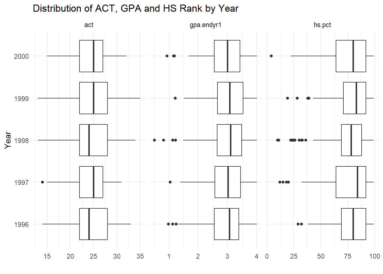
Figure 1.8: Side-by-side Box-whiskers plots showing the distributions of the variables act, gpa.endyr1 and hs.pct for each year in the uadata dataset.
This is a nice compact visual description of the changes in patterns of response of these three variables over time.
All three variables appear pretty stable over the years; the left skews in GPA and high school percentile rankings are still evident here (note the detection of some low outliers on these two variables).
We now revisit calculating summary statistics.
Extensive grouped numeric summary statistics are available by using the group_by() and summarize() functions in tidyverse.
Recall that the group_by function tells R to treat each value of the specified variable (in this case, called var_names) as a collection of similar options, then to perform the summarize function on each value in the grouped variables.
The next piece of code provides a more detailed version of the summary table from above.
library(knitr)

summary.table <- uadata.tall |>
  group_by(var_names) |>
  summarize(Mean=mean(values),
            StDev=sd(values),
            Min=min(values),
            Q2=quantile(values, prob=0.25),
            Median=median(values),
            Q3=quantile(values, prob=0.75),
            Max=max(values) )

kable(summary.table, digits=3) |>
kable_styling(full_width=FALSE)| var_names | Mean | StDev | Min | Q2 | Median | Q3 | Max |
|---|---|---|---|---|---|---|---|
| act | 24.543 | 4.014 | 13.00 | 22.000 | 25.00 | 28.00 | 35 |
| gpa.endyr1 | 2.977 | 0.635 | 0.51 | 2.609 | 3.05 | 3.47 | 4 |
| hs.pct | 76.953 | 18.634 | 4.00 | 68.000 | 81.00 | 92.00 | 99 |
Here, we first pipe the uadata.tall into a group_by() function grouping by the var_names variable.
Then we take that output and pipe it to the summarize function which allows us to calculate various summary statistics for each of the groups.
In the code above we calculate the mean and standard deviation of each group, along with the 5-number summary.
Lastly, we wrap the constructed table (its technically a data frame) in the kable() function from the knitr package (Xie, 2025) (where kable means ‘knitr’ ‘table’) for a nice display.
We pipe that output to the kable_styling() function in the kableExtra package (Zhu, 2024) for some additional formatting options (here, we condence the width of the table).
In the next example we group by both the year and the variables of interest.
summary.table2 <- uadata.tall |>
  group_by(var_names, year) |>
  summarize(Mean=mean(values),
            StDev=sd(values))
kable(summary.table2, digits=3) |>
kable_styling(full_width=FALSE)| var_names | year | Mean | StDev |
|---|---|---|---|
| act | 1996 | 24.690 | 3.885 |
| act | 1997 | 24.099 | 3.819 |
| act | 1998 | 24.506 | 4.277 |
| act | 1999 | 24.837 | 4.396 |
| act | 2000 | 24.555 | 3.609 |
| gpa.endyr1 | 1996 | 2.929 | 0.653 |
| gpa.endyr1 | 1997 | 2.974 | 0.634 |
| gpa.endyr1 | 1998 | 3.000 | 0.654 |
| gpa.endyr1 | 1999 | 3.026 | 0.601 |
| gpa.endyr1 | 2000 | 2.955 | 0.632 |
| hs.pct | 1996 | 78.296 | 15.894 |
| hs.pct | 1997 | 76.641 | 20.197 |
| hs.pct | 1998 | 74.649 | 19.983 |
| hs.pct | 1999 | 79.454 | 17.045 |
| hs.pct | 2000 | 75.876 | 19.535 |
1.6.6 Descriptive statistics and visualizations for two numeric variables
For a pair of numeric variables the amount of linear association between the variables can be measured with the Pearson correlation. The Pearson correlation assesses the strength and direction of any linear relationship existing between two numeric variables. The correlation coefficients between the GPA, ACT and HS rank variables are provided Figure 1.1.
Recall from introductory statistics that the Pearson correlation \(r\) between two variables \(x\) and \(y\) is given by the formula
\[r = \frac{1}{n-1}\sum_{i=1}^n\left(\frac{x_i - \bar{x}}{s_x}\right)\left(\frac{y_i - \bar{y}}{s_y}\right).\]
\(r\) is a unitless measure with the property that \(-1 \leq r \leq 1\).
Values of \(r\) near \(\pm 1\) indicate a near perfect (positive or negative) linear relationship between \(x\) and \(y\).
A frequently used rule of thumb is that \(|r| > 0.80\) or so qualifies as a strong linear relationship.
We can calculate the Pearson correlation with the cor() function in R.
When applied to a data.frame, or matrix, it displays a correlation matrix (correlation of all variable pairs).
In the code below we specify to only calculate the correlation based on the 3 numeric variables.
##            gpa.endyr1   hs.pct      act
## gpa.endyr1   1.000000 0.398479 0.365611
## hs.pct       0.398479 1.000000 0.442507
## act          0.365611 0.442507 1.000000
All pairwise correlations in this example are of modest magnitude (\(r \approx 0.4\)) (see Figure 1.1 or the correlation matrix above).
To visualize the relationship between numeric variables, we typically use a scatterplot.
A scatterplot is a simple bivariate plot where dots, or points, are plotted at each (\(x,y\)) pair on the Cartesian plane.
The code below uses ggplot() to build a scatterplot using geom_point().
ggplot(uadata) +
  geom_point(aes(x=act, y=gpa.endyr1) ) +
  labs(x="Composite ACT Score",
       y="Grade point average following freshman year") +
  theme_minimal()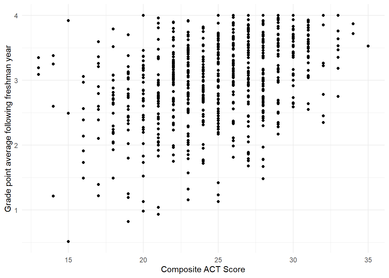
Figure 1.9: Scatterplot showing the relationship between the variables act and gpa.endyr1 in the uadata dataset.
You should note in Figure 1.9 the overall positive relationship (higher ACT scores tend to correspond to higher GPAs and corresponds to the Pearson correlation value of \(0.366\)). We also note that due to the rounding of the ACT scores (always a whole number) the resulting plot has vertical striations.
We attempt to visually address the striations with jittering (adding some visual random perturbations) in Figure 1.10 with the code below using geom_jitter().
There, we specify no jittering on the vertical axis (thus, height=0) and let ggplot2 use the default behavior horizontally.
ggplot(uadata) +
  geom_jitter(aes(x=act, y=gpa.endyr1), height=0 ) +
  labs(x="Composite ACT Score",
       y="Grade point average following freshman year") +
  theme_minimal()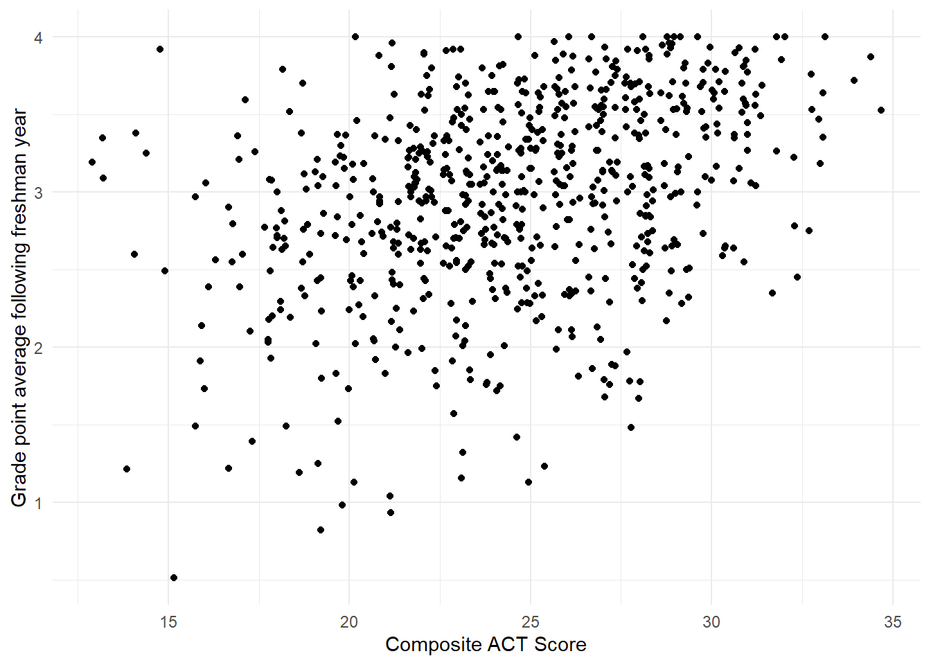
Figure 1.10: Jittered scatterplot showing the relationship between the variables act and gpa.endyr1 in the uadata dataset.
Note, with jittering we are only adding randomness to the plot, we are not changing the recorded values in the data.frame.
1.7 Sampling distributions: describing how a statistic varies
As described in the discussion on variability above, each of the numeric quantities calculated has some associated uncertainty. It is not enough to simply know the variance or standard deviation of an estimate. That only provides one measure of the inconsistency in an estimate’s value from sample to sample of a given size \(n\).
If we wish to make a confident conclusion about an unknown population parameter using a sample statistic (e.g., \(\bar{x}\)), we also need to know something about the general pattern of behavior that statistic will take if we had observed it over many, many different random samples. This long-run behavior pattern is described via the probability distribution of the statistic, which is known as the sampling distribution of the statistic.
It is important to remember that we usually only collect one sample, so only one sample estimate will be available in practice. However, knowledge of the sampling distribution of our statistic or estimate is important because it will enable us to assess the reliability or confidence we can place in any generalizations we make about the population using our estimate.
Two useful sampling distributions: Normal and \(t\)
You should be very familiar with Normal distributions and \(t\)-distributions from your introductory statistics course. In particular, both serve as useful sampling distributions to describe the behavior of the sample mean \(\bar{x}\) as an estimator for a population mean \(\mu\). We briefly review them here.
Normal distributions.
A random variable \(X\) that is normally distributed is one that has a symmetric bell-shaped density curve. A normal density curve has two parameters: its mean \(\mu\) and its variance \(\sigma^2\). Notationally, we indicate that a random variable \(X\) is normal by writing \(X \sim N(\mu, \sigma^2)\).
The normal distribution serves as a good sampling distribution model for the sample mean \(\bar{x}\) because of the powerful Central Limit Theorem, which states that if \(n\) is sufficiently large, the sampling distribution of \(\bar{x}\) will be approximately normal, regardless of the shape of the distribution of the original parent population from which you collect your sample (when making a few assumptions).
t distributions.
The formula given by
\[t_0 = \frac{\bar{x}-\mu}{{SE}_{\bar{x}}}\]
counts the number of standard error units between the true value of \(\mu\) and its sample estimate \(\bar{x}\); it can be thought of as the standardized distance between a sample mean estimate and the true mean value.
If the original population was normally distributed, then the quantity \(t_0\) will follow the Students’ \(t\)-distribution with \(n - 1\) degrees of freedom.
The degrees of freedom is the only parameter of a \(t\)-distribution.
Notationally, we indicate this by writing \(t_0 \sim t(\textrm{df})\) or \(t_0 \sim t(\nu)\) where \(\nu\) is a lowercase Greek ‘nu’ (pronounced ‘new’) and is the notation for degrees of freedom.
\(t\)-distributions look like the standard normal distribution, \(N(0, 1)\): they are both centered at 0, are symmetric and bell-shaped (see below). The key difference is due to the fact that the quantity \(t\) includes two sample summaries in its construction: the sample mean \(\bar{x}\), and \(SE_{\bar{x}}\), which incorporates the sample standard deviation \(s\). Because of this, \(t\) is more variable than \(N(0, 1)\) (more room for noise). However, as \(n\) (and hence degrees of freedom) increases, \(s\) becomes a better estimate of the true population standard deviation, so the distinction ultimately vanishes with larger samples. This can all be visualized in Figure 1.11 where the degress of freedom increase from 2 to 10 and you see the \(t\)-distribution approaches the Normal bell curve.
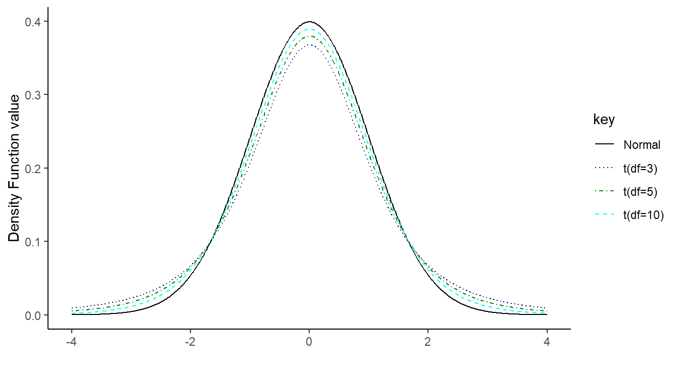
Figure 1.11: Overlayed distribution functions showing the relationship between a standard normal distribution and that of a \(t\) distribution with 3, 5 and 10 degrees of freedom. As the degrees of freedom increases, the \(t\) distribution becomes more normal
The \(t\)-distribution is usually the relevant sampling distribution when we use a sample mean \(\bar{x}\) to make inferences about the corresponding population mean \(\mu\). Later in the course, the need to make more complicated inferences will require us to develop different sampling distribution models to facilitate the statistics involved. These will be presented as needed.
1.8 Two-sample inference
A key concept from your introductory statistics course that builds off sampling distribution theory is the comparison of the mean from two populations based on the sample means using a “two-sample \(t\)-test”.
Consider testing
\[H_0:\ \mu_A = \mu_B ~~~\textrm{versus}~~~ H_A:\ \mu_A <\neq> \mu_B\]
where the notation \(<\neq>\) represents one of the common alternative hypotheses from your introductory statistics course (less than \(<\), not equal to \(\neq\), or greater than \(>\)) and, \(\mu_A\) is the population mean from population \(A\) and \(\mu_B\) is the population mean from population \(B\).
We statistically test this hypothesis via
\[t_0 = \frac{\bar{x}_A - \bar{x}_B}{{SE}_{\bar{x}_A-\bar{x}_B}}\]
where \({SE}_{\bar{x}_A-\bar{x}_B}\) is the standard error of the difference of sample means \(\bar{x}_A\) and \(\bar{x}_B\).
It can be estimated in one of two ways (depending if we assume the population variances are equal or not) and we reference your intro stat class for details (you may recall, pooled versus non-pooled variance).
In R, we can perform this test, and construct the associated \((1-\alpha)100\%\) confidence interval for \(\mu_A-\mu_B\),
\[\bar{x}_A - \bar{x}_B \pm t_{\alpha/2} {SE}_{\bar{x}_A-\bar{x}_B}\]
using the function t.test().
Here \(t_{\alpha/2}\) is the \(1-\alpha/2\) quantile from the \(t\)-distribution (the degrees of freedom depend on your assumption about equal variance).
Before jumping to an example, take a moment to look at the null and alternative hypotheses above. The null hypothesis states \(\mu_A=\mu_B\), which effectively says there is no difference in the mean between the two groups. That is, whether the data came from group A or group B it does not provide any explanation about the variability in the data. However, the alternative says that there is a difference and that knowing the group from which the data came helps explain some of the observed variability.
Now for an example, consider comparing the ACT scores for incoming freshmen in 1996 to 2000 using the university admission data. Perhaps we have a theory that ACT scores were higher in 1996 than 2000. That is, we formally wish to test \[H_0:\ \mu_{1996} = \mu_{2000} ~~~\textrm{versus}~~~ \mu_{1996} > \mu_{2000}\]
First we need to select a subset of the data corresponding to those two years.
Here we filter() the uadata so that only years in the vector c(1996, 2000) are included. Now that we have a proper subset of the data, we can compare the ACT scores between the two years and build a 98% confidence interval for the mean difference.
##
##  Two Sample t-test
##
## data:  act by year
## t = 0.3013, df = 277, p-value = 0.382
## alternative hypothesis: true difference in means between group 1996 and group 2000 is greater than 0
## 98 percent confidence interval:
##  -0.791858       Inf
## sample estimates:
## mean in group 1996 mean in group 2000
##            24.6901            24.5547
We are 98% confident that the mean difference between 1996 ACT scores and 2000 ACT scores is in the interval (-0.792, \(\infty\)). Further, we lack significant evidence (\(p\)-value \(\approx 0.3817\)) to conclude that the average ACT score in 1996 is greater than that in 2000 for incoming freshmen (also note that the value 0 is included in the confidence interval).
1.8.0.1 Coding Notes
A few things about the code above.
- We use the notation
act ~ year, this tells R that theactscores are a function ofyear. This is known as aformulaand will be important throughout the course. - We specify the data set to be used to perform the test (
data=uadata.trim). - We specify the confidence level (by default it is 0.95) with
conf.level=0.98and the alternative hypothesis (by default it is a not-equal test) withalternative=greater. - Lastly, we set
var.equal=TRUEso the standard error (and degrees of freedom) are calculated under the assumption that the variance of the two populations is equal (pooled variance).